(Because We’ve All Been Staring at Our Walls Too Much)
February in Fernandina Beach is a little confusing in the best way. The weather is pleasant, the windows are open more often, and yet you’re still indoors enough to notice things. Like how the sunlight hits your walls at a different angle this time of year. Or how that color you loved a few summers ago suddenly feels louder than you remember. People tell me February is when walls get evaluated quietly, usually mid-morning, coffee in hand.
Not because anything’s wrong.
Just because you finally slowed down enough to notice.
So instead of pretending paint trends don’t matter while clearly thinking about them, let’s talk through the paint color trends lining up to shape 2026. No design lectures. No pressure to repaint tomorrow. Just color ideas that make sense for coastal Florida homes and don’t fall apart once humidity, sun, and salt air all have their say.
Why 2026 Paint Colors Feel Right for Coastal Florida Homes
I’ve noticed homeowners here are leaning toward colors that feel calm and balanced. Fernandina Beach homes get strong sunlight, salty air, and plenty of humidity. A paint color has to behave well in all of that or it gets old fast.
Interior painters in Fernandina Beach FL are already seeing people gravitate toward shades that don’t glare in bright light, don’t feel heavy on overcast days, and still feel fresh during long, warm seasons. That balance matters here.
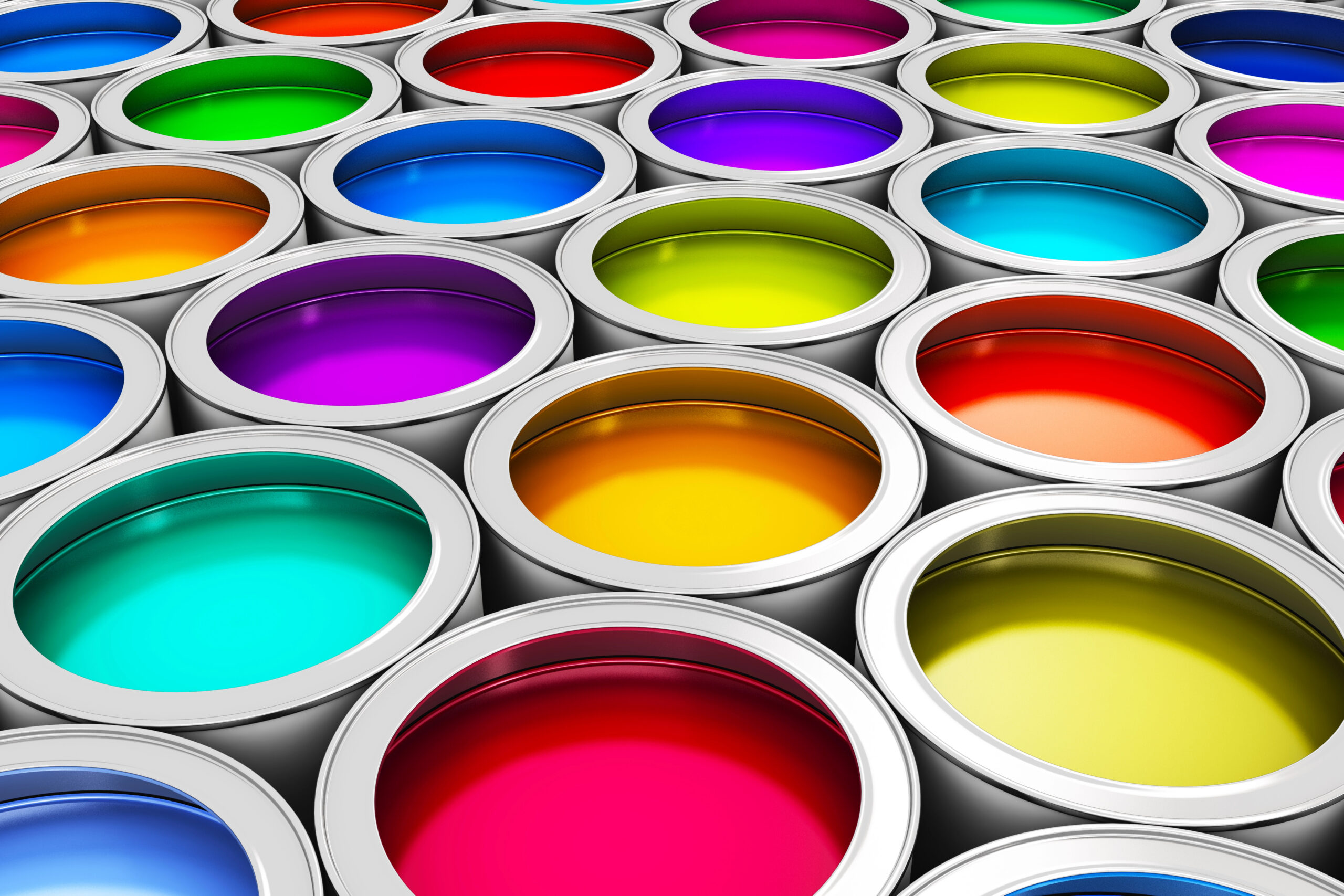
Let’s walk through the 12 colors people keep coming back to.
1. Warm Neutrals That Don’t Feel Sandy
Cool gray is stepping back.
Warm neutrals like soft cream, light beige, and gentle tan are taking over because they feel relaxed without blending into the beach too much. These shades soften sunlight and make rooms feel welcoming without going full coastal theme.
They’re subtle, but you notice the difference.
2. Muted Greens That Feel Breezy
Soft greens are sticking around, and they make sense near the coast.
These aren’t bold or leafy greens. They’re calm, slightly muted shades that feel fresh without trying too hard. They work well in bedrooms, bathrooms, and living spaces where you want a relaxed feel year-round.
3. Dusty Clay and Soft Peach Tones
This one usually gets a second look.
The 2026 versions of clay and peach are toned way down. These colors add warmth without overpowering a space and work nicely in dining areas or rooms that feel a little flat in bright light.
4. Deep Blues That Don’t Go Nautical
Moody blues are still popular, but they’ve softened.
These blues bring depth without screaming beach house. They work well as accent walls or in bedrooms where you want contrast without heaviness, even in strong Florida sun.
5. Earthy Terracotta That Feels Subtle
Terracotta has settled into a calmer version of itself.
Instead of bold orange tones, these shades feel warm and grounded. They pair nicely with natural textures, light woods, and neutral furniture common in coastal homes.
6. Mushroom and Greige That Adapt Easily
These colors quietly do their job, which is why people keep choosing them.
Mushroom tones and greige shades shift with the light throughout the day. Morning sun, afternoon brightness, evening lamps. They handle it all without feeling flat.
7. Warm Browns That Feel Intentional
Brown is easing back into interiors, but softly.
Modern browns feel warm without feeling heavy. Think light walnut or cocoa tones that add depth without closing in a room. They work well in offices, dens, and bedrooms.
8. Dusty Lavender (The Surprise Favorite)
This one always surprises people.
Dusty lavender isn’t purple in the obvious way. It’s soft, slightly gray, and calming. It works especially well in bedrooms and bathrooms where you want something gentle but not plain.
9. Warm Charcoal Instead of True Black
Black walls still feel intimidating for many homeowners. Warm charcoal feels more comfortable.
These shades add contrast and interest without making a room feel closed in, especially when paired with lighter trim.
10. Creamy Whites That Don’t Glare
Bright white can feel harsh in strong coastal sunlight.
Creamy whites with warmth built in feel softer and more comfortable. They reflect light without bouncing glare all over the room and are easier to live with day to day.
11. Sage Gray That Changes With the Light
Sage gray keeps showing up because it adapts.
It looks slightly different depending on the time of day, which keeps it interesting and makes it a solid choice for shared living spaces.
12. Misty Blues That Feel Clean and Calm
Soft blues are light, relaxed, and easy to live with. They’re popular in bathrooms and bedrooms where people want a clean feel without going cold.
How These Colors Hold Up in Fernandina Beach Weather
Homes here deal with strong sun, salty air, and plenty of humidity. These 2026 colors were chosen because they stay consistent through those conditions and don’t rely on perfect lighting to look good.
Common Color Mistakes Homeowners Still Make
A few patterns come up again and again:
- Choosing colors only under store lighting
- Skipping test patches
- Forgetting how sunlight affects tone
- Ignoring sheen differences
Paint behaves very differently on real walls.
A Helpful Florida Resource
For general homeowner guidance and safety information in Florida, this is a useful place to reference:
https://www.myfloridalicense.com
A Comfortable Way to Wrap This Up
Trends are helpful, but the right paint color should still feel good long after February passes. Whether you repaint this year or just start paying attention, these 2026 colors give you options that won’t feel outdated anytime soon. And if you ever want help testing colors, talking through ideas, or getting paint on the walls without second-guessing everything, Halls Quality Painting and other experienced residential painters around Fernandina Beach are always a steady option. No pressure. Just help when you’re ready.